Ozmo report
Very few users uses the key feature - Report
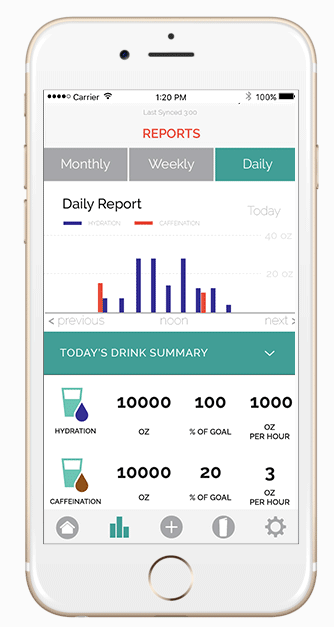
Old report issues
-
Difficult to navigate
-
Difficult to understand graph
-
Too much information on the same page
-
The dates are very difficult to read
How might we present all the logged information on the report page without confusing the users?
Testing
-
Let's try different ways to present the graph
-
Test with different tester
-
Quick 10 minutes talking to two group of testers for feedback.
-
6 testers in each group.
Direction 1
-
Divide up different drink under different tab
-
Area graph

User feedback
✔ It’s blue so it’s water related
✔ Easy to read **
✔ Can select different views
✔ More encouraging
✔ Prefer the circle goal graphic
✔ Clear
✘ Not colourful
Direction 2
-
Combine all the logged drinks on one graph
-
Line graph.

User feedback
✔ Reaching their water drinking goal
✔ More informative
✔ Can compare different drinks
✔ It’s more colourful
✘ Not related to water
✘ Difficult to understand, too many lines
✘ It’s a cold graph
✘ For other drinks can be confusing
✘ Too many numbers

Development
Repeat the prototyping and testing steps,
while developing the report features.

Imagine if...
The report gets smarter
And it is more than a cold graph

Prototype via Invision
New report demo
Recorded from live Ozmo app
REsult
From 0
to 2500+
Engaged users
Ozmo Report feature user trend
